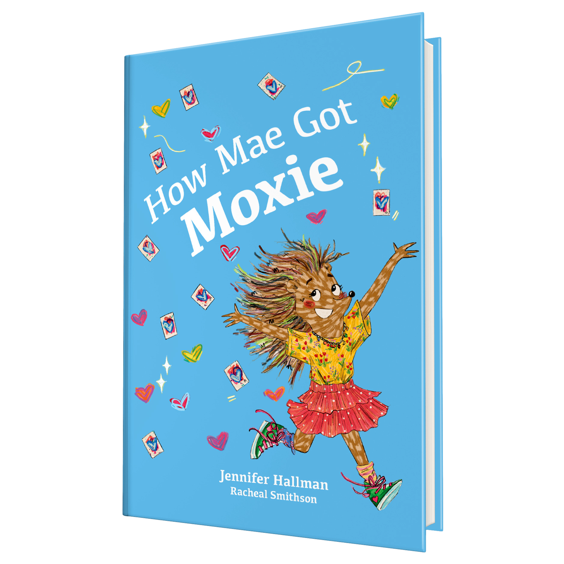
Creating Mae
Creating a children’s book is rarely a straight line. Sometimes it looks more like paint swatches spread across a table, screenshots of vintage jackets, debates about neon thread, and a room full of creatives trying to decide whether a character would realistically sew a heart onto a sleeve.
Recently, author Jennifer Hallman and her illustration team invited viewers into that wonderfully messy process during a behind-the-scenes design session for Mae — a story already brimming with color, personality, and nostalgic charm.
What emerged from the conversation wasn’t just a jacket design. It was a glimpse into how thoughtful storytelling happens through tiny visual details.
The Jacket That Became a Character
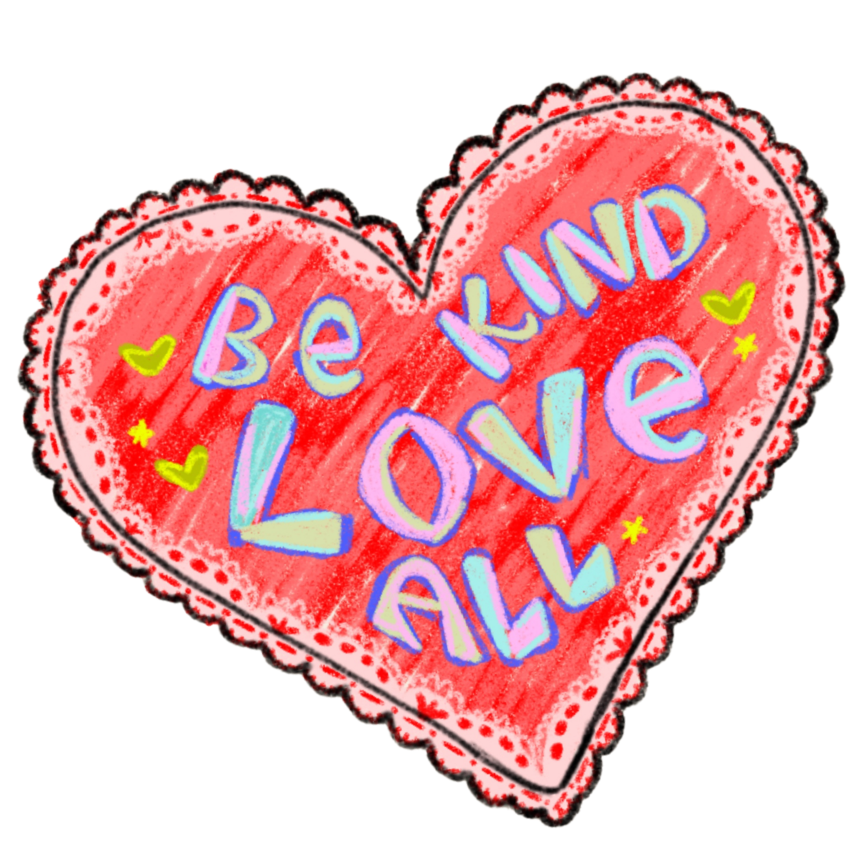
At the center of the discussion was May’s iconic jacket — a quilted, vintage-inspired piece that needed to feel handmade, expressive, and unmistakably hers.
The team explored every possibility:
- Was it a sweater or a jacket?
- Should it have a collar?
- Would it feel more 80s-inspired or timeless?
- Could the heart patch be painted directly onto fabric?
- Should the stitching remain visible?
What sounds like small artistic choices quickly became storytelling decisions.
Hallman referenced soft mint-green tones and nostalgic childhood fashion while the illustrators experimented with textures, layered fabrics, and colorful accents that would make the design feel emotionally warm and visually memorable.
Why Tiny Details Matter in Children’s Books
One of the most fascinating moments came when the team discussed the heart stitched onto May’s sleeve.
Should the stitching use contrasting thread? Neon colors? Imperfect handmade lines?
These decisions weren’t merely aesthetic. They reinforced the emotional core of the story: creativity, individuality, and the beauty of making something by hand.
The illustrators even discussed printing limitations and how to preserve bright, glowing colors within the publishing process — proof that children’s publishing is equal parts artistry and problem-solving.
Building a World Through Color
The conversation also revealed how carefully curated the book’s visual palette has become.
- Prismacolor pencils
- Vintage-inspired greens and reds
- Striped 80s-style outfits
- Monochromatic emotional transitions
- Neon accents representing personality and growth
At one point, the illustrators discussed how Mae’s wardrobe could subtly evolve throughout the story as her emotions shift and mature.
Young readers may never consciously notice these visual cues, but they help create emotional resonance beneath the surface of the story.
The Magic of Collaborative Creativity
What makes this behind-the-scenes look so compelling is how collaborative the creative process really is.
Ideas bounced freely around the room:
- Hidden recurring “Steve” references
- Character hairstyles inspired by letters
- Vintage-inspired family aesthetics
- Future merchandising possibilities
- Subtle symbolic costume design
The room was full of unfinished thoughts, laughter, experimentation, and creative spontaneity — exactly what artistic development looks like before it becomes polished and printed.
More Than a Book
What’s becoming clear is that Mae isn’t just being illustrated. It’s being built — piece by piece, stitch by stitch.
From emotional symbolism hidden in clothing details to discussions about future posters and merchandise, the team is crafting a world that feels deeply personal and lived-in.
And if this design session is any indication, readers are in for something special: a story filled with heart, nostalgia, creativity, and characters who feel handmade in the very best way.